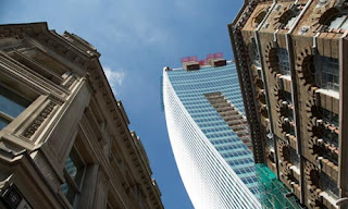
According to the Telegraph Newspaper there are a few building around the world that does not comply with the judge's aesthetic eye!
http://www.telegraph.co.uk/property/propertypicturegalleries/9126031/Are-these-the-ugliest-buildings-in-the-world.html?frame=2159733
From a bubble diagram to a sketch and to the real deal. Describing every detail to the finest and making sure that what they are busy constructing reveals not only the master's idea, but the thought after every line that was drawn on a microfilm paper sheet with an ink filled filter pen that could last for an amount only the designer would know.
I have no idea how I would feel if I would be in the shoes of those designers. Maybe if the theme was the worst building or even the cheapest, then I could understand. See the buildings below and judge for yourself!
The ArcelorMittal Orbit sculpture and observation
tower at the London 2012 Olympic Park
Aldar headquarters
building in Abu Dhabi. Designed by MZ Architects and opened in 2010. This
coin-shaped building is the world's first circular skyscrape
Federation Square in
Melbourne, Australia. Designed by Lab Architecture Studio and Bates Smart.
Opened in 2002
The Tours Aillaud (also
known as Tours Nuages) in Nanterre, a suburb of Paris, France. Designed by
Emile Aillaud and built in 1977
The National Library in
Pristina, Kosovo. Designed by Croatian architect Andrija Mutnjakovic and opened
in 1982
The 105-storey Ryugyong
hotel in Pyongyang, North Korea. Designed by Baikdoosan Architects &
Engineers. Construction began in 1987 and stopped between 1992 and 2008.
Exterior work is now complete, but it is not known if it will ever open.
So all these building above was rated as ugly. It what sense do you rate a building as ugly. Is it the wrong angle, the external material and finishes or is it simply just the design.
Each and everyone to me is unique with a sense of style and personality. If I should describe the Ryugong Hotel above I would simply give it the characterization of:
- strength
- rigidness
- diagonal lines
- stability
- movement in a sense that it leads the eye to an upward angle
- smooth - finishes of metal and smooth surface
- color is conservative and cold
- a sense of uniqueness and standing on its own above the rest
All these points adds to the buildings character and to me they are everything but ugly. More like standing on their own, with their own personality and look. a Reason for living - a statement that should be made by their existence.
Simply Amazing...!
What makes your building unique?...


